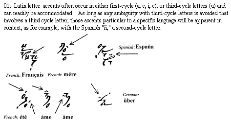
Back Home
PDF Version: . . . . Structure of Elian Script
An Alternative Writing System Whose Properties
Combine the Linearity of Spelling with the Free-Form Nature of Drawing
Created by C.C. Elian
Introduction
The configuration of Elian script consists of a formal structure (Part I,) and three basic structural principles Part II).
Formal Structure
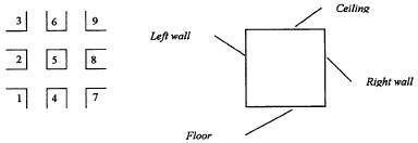
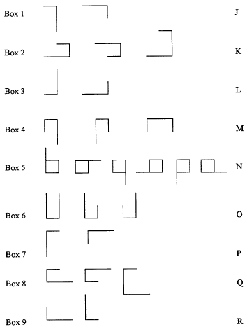
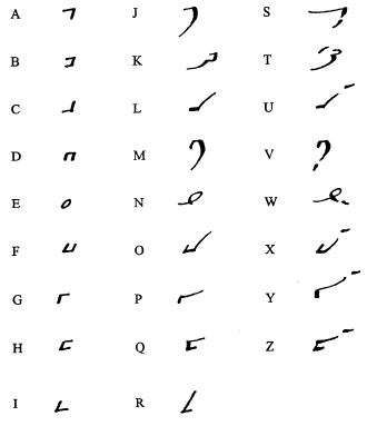
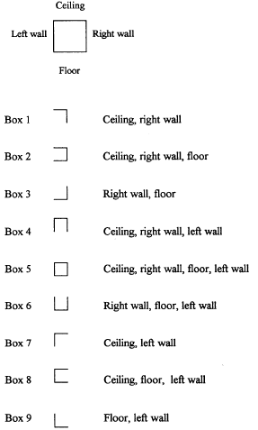
The formal basis of Elian script is derived from positioning the 26 letters of the English alphabet within a nine-square grid.
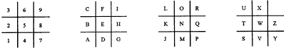
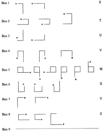
The letters of the alphabet are placed successively, starting at the bottom left corner of the grid at Box 1 with the letter "A", upward to Box 3, down to Box 4, up to Box 6 then down to Box 7, ending at the top right corner at Box 9. Similarly a second cycle begins at Box 1 with the letter "J," ending at Box 9 with the letter "I", and finally a third cycle begins at Box 1 with the letter "S," ending at Box 8 with the 26th letter "Z."

Each box of the grid has a specific linear configuration. One can describe the center Box, 5, as a room with a ceiling, floor, and two side walls. Box 1 then has a right wall and a ceiling; Box 2 has a floor, ceiling, and right wall; Box 3 has a floor and right wall, and so on.
If the alphabet only had nine letters, the form of each box could stand for a single letter.
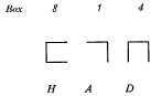
Fitting the 26 letters of the English alphabet within the nine-box grid results in assigning three letters to each box (as in a telephone grid), except for Box 9, with only two. In order to use the form of a given box for three letters, we need a system to distinguish between them.
The different letters within each box can be indicated by changing the length of the boxe's lines. The diagram below shows Box 1 with its linear configuration in two different states: with both lines equal, and with the lines unequal.
Box 1
Regardless of the length of each box's line(s) in relation to any of the other line(s), their relationship relative to each other remains constant. That is, Box 1 always consists of two lines, one horizontal - the ceiling - and another vertical - the right wall - meeting at the upper right corner.
When the length of the lines of a box are equal, we obtain the following correspondences for the first sequence cycle of nine letters (A through I):
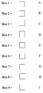
Part I Table 1 - First cycle letters
The letters of the second cycle of letters (J through R) are indicated by changing the length of at least one of the lines, such that a box's lines are of unequal length. Apart from the aesthetic implications, the choice of which line to lengthen is immaterial.
Although for aesthetic reasons more than one line can be lengthened for boxes with three lines (2, 4, 6, and 8,) only one of the lines needs to be lengthened to satisfy this structural rule; the overall structure will still consist of lines of unequal lengths. Box 5 is unique in having four lines, but the lengthening method is equally applicable, as shown below:
Part I Table 2 - Second cycle letters
Now it is possible to distinguish between the letters of a box's first cycle from those of its second. All that's left is to represent the letters of the third cycle (S through Z). These are indicated by adding a simple mark (dot, dash, etc..) to the set of unequal lines characteristic of the second cycle.
Part I - Table 3 - Third cycle letters
Each letter now has a specific encoded form:
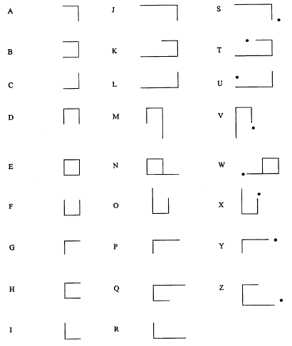
Part I - Table 4 - Basic configuration for all letters
Except for the image at the top, all of the examples so far display the rigid form, with a 90° right angle. This was done for the sake of illustrating the structural principles. In practice the forms are not fixed but flexible, to permit maximum aesthetic freedom. This writing system has no rules concerning the types of line used (straight, curved, mixed) or the type of angles connecting them. Variations in either case will not affect the basic relationships between the lines of a given word or set of words.
A fluid form is especially appropriate for Box 5, the central box, which consists of a square in its rigid form. The main feature here is not squareness, but closure. Giving it a circular form maintains closure, while offering a more graceful appearance. A round shape lends itself easily to the addition of a tail for the second cycle letter, and a tail plus a mark for those of the third, as shown in the diagram below.
Part I - Table 5 - Letters in box 5
Any word can be spelled with this system of lines and dashes (or dots). Below is an illustration of the word "spelling" in both the rigid and flexible forms. So far we are still dealing with a linear arrangement of the letter sequence; the actual practice of Elian script allows for stacking each word into as many baselines as number of letters comprising it. Please see The Three Basic Structural Principles below in Part II.
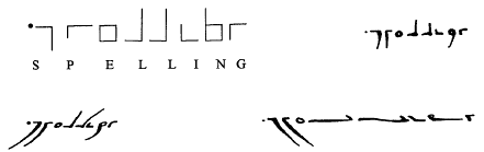
Part I - Table 6 - From rigid to fluid form
Below is an example of the entire alphabet in one of the many possible fluid forms:
Part I - Table 7 - Example of alphabet in fluid form
End of Part I
The Three Basic Structural Principles
In addition to the formal elements outlined in Part I, there are three basic principles to observe in the practice of Elian script.
1: Clarity of Line Length (for 1st and 2nd cycles)
If the lines refer to a letter of the first cycle, then they must appear to be of equal length whether they are 1/4" or infinitely long. Similarly, it is just as essential for lines of different lengths to appear unequal. The actual measurable length is not the point, but rather the visual impression created by the linear relationships in all cases. The main consideration is to avoid ambiguity, or doubt.
2: Clarity of Dash Placement (for 3rd cycle)
As mentioned in Part I, the location of the dash or dot for letters of the third cycle is a matter of choice, again guided by the wish to avoid visual ambiguity. This emphasis on the avoidance of ambiguity is crucial because the Elian Script is composed only of lines and dashes. Making a line a little too long or too short, a dash a little too close or too far, could result in a misspelling, e.g., a different letter than the one intended. At the same time, there is a great deal of freedom in the design, sequence, and placement of the formal elements. The need for a certain degree of precision, on the one hand, and the potential for free expression on the other, gives the practice of this writing system its own dynamism and creative tension.
It is this aspect of Elian script that offers a genuine element of drawing. There is no rule or principle beyond these three structural principles that determines the angles between the line coordinates, the length of the lines, or the appearance of new baselines. Each word can have many appearances to it, the more letters the more possible combinations, sometimes in the thousands. This is where the Elian script differs from ideogrammes, where the ratio of lines to one another and their sequence is fixed.
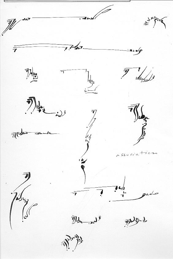
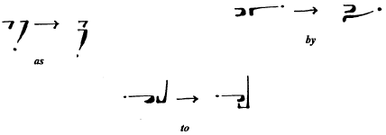
The issue of dash placement is especially crucial when two or more letters of the second and third cycles stand in close proximity in a word, as in the example below:
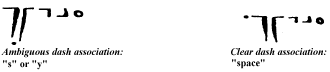
Part II - Table 1 - Dash association
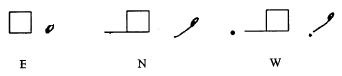
I have been using the word "dash" for the sake of simplicity In practice, the "dash" could just as well be a dot or, for that matter, any mark that is clearly not a line.
Part II - Table 2 - Examples of marks or dashes in the letter "s"
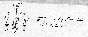
3: The Compositional Direction of Letter Sequences:
Left before Right,
Top before Bottom
English is an alphabetic language and conventionally written from left to right along a horizontal line. However, the writing of Elian script is not restricted to a single baseline. The coded letters of a word can be stacked vertically to a greater or lesser degree, while still maintaining a left to right course. Whether they are disposed horizontally then vertically or, alternatively, horizontally then vertically, the eye can easily follow the "letters" forming a word. This sequence can be exemplified in its simplest form with words of two letters.
Part II - Table 3 - Compositional sequence words of two letters
With words of more than two letters, the same procedure applies, as shown below:
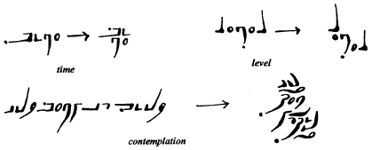
Part II - Table 4 - Compositional sequence words of more than two letters
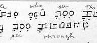
In each case, the eye moves across the topmost level from left to right until there is no further sign, then down to the next level, again starting from the left, and so on. As with line length and dash placement, there should be no ambiguity as to the position of a group of "letters" in relation to each other. It should be clear that a "letter" stands to the left or right of another, or that a set of "letters" is above or below.
Depending on their lengths, lines will often cross the levels above or below; but it is the visual center of gravity that will define their position at a given level. This center of gravity is typically the natural baseline of a set of letters. An effective method for evaluating the clarity of a word's composition is to put it aside for some time, then return to it later with fresh eyes. Whatever you perceive then will either confirm the viability of the composition or reveal its weaknesses.
End of Part II
Appendix I
Appendix I - Table 1 -- Unique configuration of each box
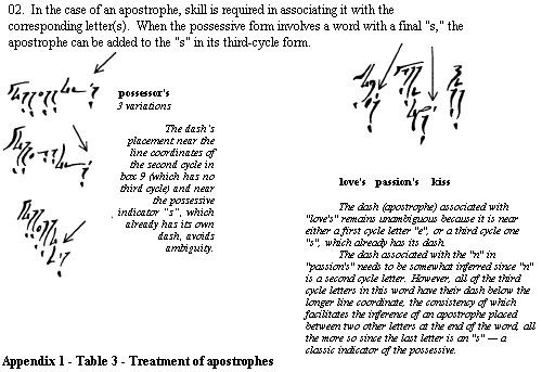
(Above) Appendix I - Table 2 - Treatment of accents
Appendix II
For the material below in PDF format, with higher resolution illustrations and additional material on compositional variables please link here: Variables and Evolution of Elian Script
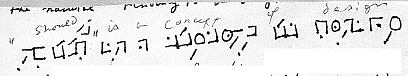
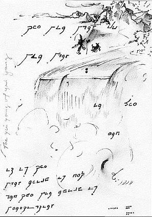
Originally, Elian script was intended to be a code by which I could, at a glance, differentiate writings in my notebooks that were still in finished form from those still in the works. Prior to the development of this code I used the letters of the Cyrillic alphabet as sheer phonetic elements; "Tuscany" would thus be written ![]() . However, the more I wrote phonetically in Cyrillic, the more my spelling in English deteriorated -
. However, the more I wrote phonetically in Cyrillic, the more my spelling in English deteriorated - ![]() back to English would be written "Tskani".
back to English would be written "Tskani".
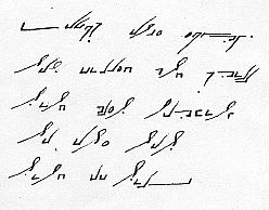
While seeking a new and simple encoding method, I came across an illustration of the numbered nine-square grid. It occurred to me that each of the nine boxes had a unique configuration, and that with the addition of a numeral, be it "1", "2", or "3", it was possible to have a coded form for each of the 26 letters of the alphabet. I started to use this grid functionally, as a code, without considering any calligraphic aspects.
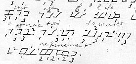
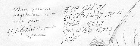
I periodically edited my writings and transferred them to new notebooks, using the code/calligraphy in whatever state it was at the time, and kept early examples as interesting reminders of how it all began. Most dates below are approximations.
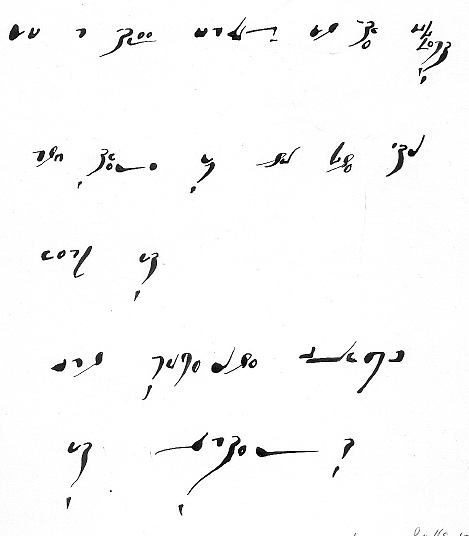
Below is the code when I first formed it, and beneath it a sample of the calligraphy into which it has developed. Following is a series of illustrations showing the gradual evolution from one to the other.
(Above) - 1 - Earliest form as code only -
have a long history, however they stay in their original box format. (Ca. 1980)
(Above) - 2 - Later Form as Code and Calligraphy - (Ca. 2000)
(Above) - 3 - Earliest Version
(Above) - 4 - Numbers appear outside of boxes -
(Above) - 5 - Lines lengthen for increased speed of writing. (Ca. 1983)
(Above) - 6 - Numbers are replaced by number of dots - (Before 1984)
(Above) - 7 - Two dots for 2nd cycle are combined into a dash
(Above) - 8 - Dashes become slanted (Ca. 1984)
(Above) - 9 - Dashes connect to boxes for 2nd cycle -
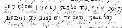
(Note the double "d" of the word "middle" in the top line.)
This abbreviation was soon discarded. (1985)
 - 10 - Dot for 1st cycle is replaced by equal box line lengths.
Lengthened line used for 2nd cycle and dot added for 3rd cycle.
Letter composition starts to stack. (Writing is in French: "le passé du passé". Ca. 1986.) |
 - 11 - Common walls still used - Writing is in french: "le début de la mort - la naissance. (Ca. 1986)
|
(Above) 12 Common walls no longer used -
(Ca. 1987)
- 13 - Letter sequence stacks more
readily with discard of common walls -
(Ca.1987-1988)
- 14 - Calligraphic element appears -
(Ca.1989)
(Above) - 15 - Calligraphic element becomes deliberate -
(Ca. 1991)

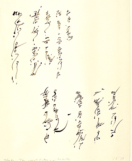
(Above) - 16 - Stacking of letters becomes preferred composition -
(Ca. 1993)

(Above) - 17 - Stacking, with word direction from left to right -
(Ca. 1994)
(Above) 18 Stacking with words moving top to bottom - (Ca. 1993)
(Above) - 19 - Stacking with words top to bottom - (2000)